That’s how I feel about charts, graphs and spreadsheets.
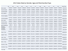
This is an Analytical Spreadsheet
So many speakers fill their presentation PowerPoint slides with charts, graphs and spreadsheets, they surround themselves with them, and they’re the wrong charts, graphs and spreadsheets.
Charts, graphs and spreadsheets are a wonderful way to visualize data. Organizing the raw data in a structured matrix, like an Excel spreadsheet, or charting or graphing it, allows us to see things that we might not have otherwise noticed.
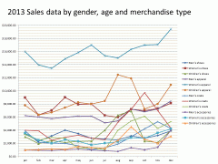
This is an Analytical Graph
Anomalies jump out at us. Subtle trends are made apparent. We can play with parameters of a graph to focus on the macro or the micro. We can process the spreadsheet data to tease out previously unseen correlations. We can mine the data to our hearts content.
But when we are giving a presentation, that’s not what we are doing, at least I hope not, and it’s certainly not what we want our audience to be doing.
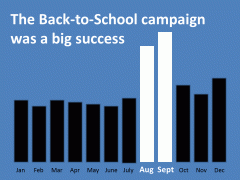
This is a Presentation Chart
When we speak, we want the audience to be paying attention to our argument, proposal, procedure or scenario, not analyzing the data. The purpose of a PowerPoint slide is to reinforce our words visually. Each needs to make the same single, clear and unambiguous point we are making, at that moment, with our words.
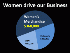
This is a Presentation Chart
That’s the purpose of presentation charts, graphs and spreadsheets, not to visualize the data, to visually reinforce, support and validate our words.
If you feel the need to supply your audience with the full range of data, by all means, provide them with all the analytical charts, graphs and spreadsheets they can carry…….., after your presentation. Let them wallow in the data to their heart’s content, just as you did.
But build your presentation slides to make one clear point.


